Tchotchke

I have been seeing the term "tchotchke" used a lot lately. The new store in SanFranscisco Jett Modern has a whole category of accessories called Tchotchke. The Gold Gnomes by Phillipe Starck are my ultimate tchotchke.

This is the offical dictionary definition:
tchotchke \CHOCH-kuh\, noun: A trinket; ... Tchotchke is from Yiddish tshatshke, "trinket," ultimately of Slavic origin.

isak

: : lovely patterns at .isak. I think it's a Swedish designer based in Britain.

White Chic

Patricia Gray

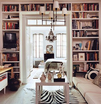
Using white in a room can make it have surprising depth - I use several shades of white to bring out the architectural details in a room, or I layer the space with strong forms in different tones and textures of white and use some strong contrasts to outline and bring the white into focus. Some of my favourite whites I use are: Benjamin Moore - Cloud White, Simply White, Ballet White, Designer White. Not every white is snow white. Try using: ivory, cream, antique white, and palest beige.

Nothing is more chic than WHITE ON WHITE


Some white facts from the web:

Ultimate Light: White is purity, cleanliness, and innocence. Like black, white goes well with almost any color.

Culture of White: In most Western countries white is the color for brides. In the East, it's the color for mourning and funerals. Some cultures viewed white as the color of royalty or of deities. Angels are typically depicted as wearing white. In early Westerns the good guy wore white while the bad guy wore black.

Using White: In most cases white is seen as a neutral background color and other colors, even when used in smaller proportion, are the colors that convey the most meaning in a design. Use white to signify cleanliness or purity or softness. Some neutral beige, ivory, and creams carry the same attributes as white but are more subdued, less brilliant than plain white. Use lots of white for a summery look. Use small amounts of white to soften a wintery palette or suggest snow.

Using White with Other Colors: Used with light or pastel tones, white is soft and Spring-like and helps to make the pastel palette more lively. White can make dark or light reds, blues, and greens look brighter, more prominent.

White Words: These words are synonymous with white or represent various shades of the color white.


pearl
antique white
ivory
chalk
milk white
lily
smoke
seashell
old lace
cream
linen
ghost white
beige
cornsilk
alabaster
paper
whitewash

Victoria Hagen Patricia Gray

Purple Area
Lamp by Tobias Wong

- with a coat of white paint even the most traditional forms can be transformed into something altogether new.

Coat rack by Seattle artist Erich Ginder

Patricia Gray Regina Chair

Wing Back chair by Victoria Hagan

Ghost Chair by Philip Starck
John Saladino Porticus Bench
Click here to see other posts on Color

Bookshelves

Books are such a wonderful way of personalizing your space. Who doesn't love to be surrounded with all this wonderful inspiration. I think rooms with bookshelves are some of my most memorable spaces. Everyone feels comfortable in these rooms and they are rooms where you want to linger. I have a girlfriend who has a monumental bookshelf in her dining room. I always love to sit at the table across from the bookshelf so I can peruse the shelves between the dinner conversation. I have categorized the following pictures of bookshelves into 6 sections:

1. Bookshelves in Living Rooms


Purple Area


Poliform


Domino Magazine

2. Bookshelves with ladders


Purple Area

Purple Area

3. Bookshelves in Offices


Jan Showers

Domino magazine

4. Bookshelves in Dining Rooms

5. Most Clever Bookshelf


6. Bookshelves in Bedrooms


Clever Design - Device Holder


I found this wonderful holder at an on-line store called A Plus Store. What a clever design. If you are anything like me you have all kinds of things that need to be charged. I have been waiting for someone to come up with a universal charger (if anyone knows of one, please let me know). Everytime I buy a new gadget I get a new charger and I am running out of places to keep them all plugged in. So far the chargers I have are: blackberry, bluetooth headset, IPod, 2 cameras, laptop, recorder. Last week I lost the cord for the charger for my cell phone in the paper shredder because it was plugged in above it and of course the cord dangles down. This holder would have avoided that. And what a stylish way to store your devices. It is designed by Germans, of course, and the price is reasonable - $15.00. I think it looks very chic, a lot nicer than all those dangling cords. It is very simply a flat piece of white plastic, flocked on the inside--in black, red or pink--forms a "tray" that cradles your device. I have put my order in for the black one. Now for a universal charger so I can charge everything with one holder!!!!!!

Yellow Chic

Imperial Trellis Fabric - Kelly Wearstler

Flickr


Victoria Hagan

Domino Magazine


Purple Area

Pieces Inc

HollyHock LA

wallpaper by Quadrille Lyford Trellis
Colorama

I have long had a fixation with the color yellow, although I haven't used it much lately in my Interior Design projects I am always inspired by it. I need to change and use it more because I love it. Color researchers believe the color Yellow to increase self-esteem and strengthen the overall well-being. Yellow wakes up a room like the rising sun, it is cheerful and uplifting. I also find it to be a very CHIC color and am always attracted to it. It is supposed to have the longest memory retention of any color. So I used to use it when I did show suites. I would put yellow flowers or yellow pictures in the home so if people were looking at a lot of projects, mine would be remembered. It is also a good color to paint your house when you are wanting to sell it.....because yellow houses sell faster. Also yellow cars have fewer accidents.

Some yellow facts from the web:

Hope and Happiness: Yellow is sunshine. It is a warm color that, like red, has conflicting symbolism. On the one hand it denotes happiness and joy but on the other hand yellow is the color of cowardice and deceit.

Nature of Yellow: Yellow is one of the warm colors. Because of the high visibility of bright yellow, it is often used for hazard signs and some emergency vehicles. Yellow is cheerful.

Culture of Yellow: For years yellow ribbons were worn as a sign of hope as women waited from their men to come marching home from war. Today, they are still used to welcome home loved ones. Its use for hazard signs creates an association between yellow and danger, although not quite as dangerous as red. If someone is yellow it means they are a coward so yellow can have a negative meaning in some cultures.
Yellow is for mourning in Egypt and actors of the Middle Ages wore yellow to signify the dead. Yet yellow has also represented courage (Japan), merchants (India), and peace.

Language of Yellow:
The use of yellow in familiar phrases can help a designer see how their color of choice might be perceived by others, both the positive and negative aspects.

Good yellow

Yellow ribbon - hope, support, remembrance
Mellow yellow - laid back, relaxation Bad yellow
Yellow or Yellow streak or Yellow-bellied - cowardice or coward
Yellow journalism - irresponsible reporting

Yellow Words:
These words are synonymous with yellow or represent various shades of the color yellow.
Lemon, yellow ocher, golden, saffron, cream, topaz, mellow yellow.
Click here to see other posts on Color

Simplicity

If you are like me and so many others with busy lifes and careers, I am always on the search for ways to simplify my life, organize my work, keep on top of things, file information so I can find it when I need it. So when I came across this book I thought maybe it held the answer.

The book Laws of Simplicity offers ten laws for balancing simplicity and complexity in business, technology, and design. But after I had tried to this book, which I found to NOT be a simple read. I have to say it falls under Law #9Failure - some things can never be made simple. Like I am always trying to achieve the simplest of designs which I find are the very hardest, because everything has to be detailed to perfection equates to Law 5 - simplicity and complexity need each other. Sometimes I love the simplest of design and sometimes I am attracted to over the top design. Sometimes simplicity works and sometimes not. Maybe there is something to the adage that "opposites do attract".

Simple things I love: my Ipod, my Blackberry, blogging, designs by Christian Liagre
Complex things I love: travel (getting through security), playing the piano, finding the perfect bottle of wine, designs by Kelly Wearstler

TEN LAWS
1. REDUCE The simplest way to achieve simplicity is through thoughtful reduction.
2. ORGANIZE Organization makes a system of many appear fewer.
3. TIME Savings in time feel like simplicity.
4. LEARN Knowledge makes everything simpler.
5. DIFFERENCES Simplicity and compleity need each other.
6. CONTEXT What lies in the periphery of simplicity is definitely not peripheral.
7. EMOTION More emotions are better than less.
8. TRUST In simplicity we trust.
9. FAILURE Some things can never be made simple.
10. THE ONE Simplicity is about subtracting the obvious and adding the meaningful


Simple ....but complex


Complex ...but simple