 : : there's something about rooms with dark walls....having been inspired by the most recent domino issue [see post below] I am seriously considering painting our guest bedroom dark blue. I love the .soot. color by benjamin moore in the kitchen photo above. I like the contrast of dark walls and crisp white trims. and I'd love to add a bohemian feel with a mix of different patterns, gold and silver. I like the rug in the domino pic above. maybe I can even convince .iz. to let me put an open clothes rack in the room to hang my dresses, scarfs and hats on. .iz. could fit some of his suits too *smile*.
guest bedroom inspiration
 : : there's something about rooms with dark walls....having been inspired by the most recent domino issue [see post below] I am seriously considering painting our guest bedroom dark blue. I love the .soot. color by benjamin moore in the kitchen photo above. I like the contrast of dark walls and crisp white trims. and I'd love to add a bohemian feel with a mix of different patterns, gold and silver. I like the rug in the domino pic above. maybe I can even convince .iz. to let me put an open clothes rack in the room to hang my dresses, scarfs and hats on. .iz. could fit some of his suits too *smile*.
darks, lights & jcrew
 : : i really enjoyed .domino's. featured article [this month] on the home of j.crew creative director .jenna lyons' home. I particularly enjoy the high contrast between dark and light colors in almost every room. and it really shows that they were selective and chose pieces with care. pieces that feel as if they are part of the apartment.
I was also interested to learn more about j.crew as a brand and company. they have come a long way in recent years. I apparently wasn't the only one who found their clothes "boring and plain" a few years back. whereas now, I can't even look through one of their catalogs without finding a few 'must-have' items [like the pink ruffled shirt in the top corner].
Mirror Magic
Not much has been written about the merits and sheer magic of using mirrors as focal points and works of art in rooms. So I would like to dedicate this post to the beauty, genius, and magic of mirrors. Everyone has either seen or heard of the famous Hall of Mirrors in the Palace of Versailles, built by Louis XIV in 1678. The principal feature of this famous hall is the seventeen mirror-clad arches that reflect the seventeen arcaded windows that overlook the gardens. Each arch contains twenty-one mirrors for a total of 357. In the 17th century, mirrors were among the most expensive items to possess and at the time and the Venetian Republic held the monopoly on the manufacture of mirrors. The expense in manufacture of mirrors has come a long way since those days.
Mirrors over fireplaces:
One of the places in a home most adorned with a mirror, other than the bathroom, is over the fireplace. It is the perfect focal point in a room to strategically place a mirror. Depending on the room and the orientation of the fireplace, a mirror hung over the fireplace can reflect other important areas of the room and create drama and atmosphere. In the living room below I used a laser cut mirror above the fireplace, which echoes the filigree pattern in the framed wallpaper panels on either side of the fireplace. I painted the wall behind the mirror a deep chocolate brown to further define the edges of the mirror. The curtains are the same rich chocolate brown color and are made of silk taffeta which further adds to the shimmery effect at night.
Mirrors in Bathrooms:
Bathroom mirrors come in every size and configuration. In my designs I try to come up with something unique, while still being very functional. In this bathroom my client wanted a 3 Way mirror. So handy if you want to get a 360 degree view of yourself. The mirror over the vanity is double sided circle, that echoes the shape of the matching back to back sinks. The mirror is attached to the ceiling and to the vanity at the top and bottom with clear glass.
What do you do if you have a window in front of your vanity? Below in my own bathroom I used California shutters for the window covering. I love the look and feel of California shutters. I designed the room so that the sink was centered on the length of the window. I had the stile of the shutters made to line up perfectly with the center of the sink, then I had my glazier design a special mounting that would allow the mirror to be attached to the stile, while still allowing the shutters enough space behind the mirror to open and close. The mirror appears to be floating in front of the shutters.
Mirrors in Dining Rooms:
This is a picture of the breakfast area in my own home. The mirror helps to enlarge this small space and bring in the view of the garden. By placing a lamp on the table in front of the mirror it creates the illusion that the room continues. The lamp also creates some drama and makes it a cozy spot to sit and linger in the evenings. You can read more here, where I talk about my Lucite lamp and mix of chairs.
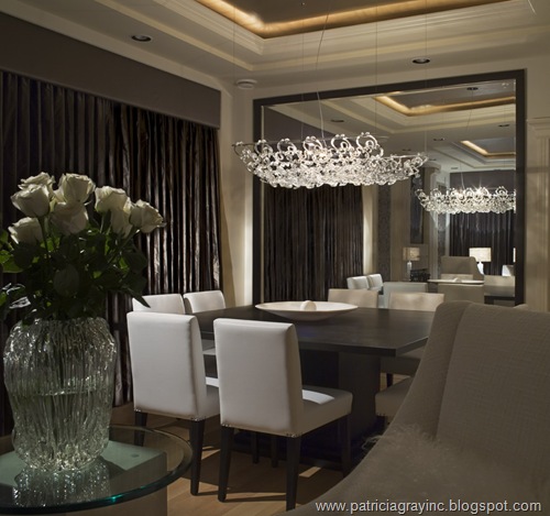
The mirror I designed and had built for my client's dining room. It perfectly reflects the magnificent Murano glass chandelier hanging over the custom built large square dining table. It also captures views of the adjoining living room for people that are sitting with their backs to it. When you are making mirrors this large make sure that they will fit through the front door. I made that mistake once and that was enough to learn a very valuable lesson: check and double check every detail!! If it still won’t fit, I have the mirror made on-site. The draperies are made of chocolate brown silk taffeta with a padded valance, the ceiling inset is lit around the perimeter and painted with gold leaf.
Mirrors in Bedrooms:
In this bedroom I placed a full height mirror for the client to use as a dressing mirror.
PATRICIA GRAY INC is an award winning interior design firm writing about lifestyle and
WHAT'S HOT in the world of interior design, architecture, art and travel.
2011 © Patricia Gray | Interior Design Blog™
new england fall

: : October in Boston this year has been one of the best months of the year. we've had warm weather, sun, crisp air and all the beautiful colors that come with fall. I know this is the favorite season for many. For me, nothing will ever beat summers in Sweden, but fall in New England is in second place and getting better and better for every year.
we spent this past weekend with friends at a house on a river in New Hampshire. and had a lot of fun playing around in the leaves.
spice up a regular bouquet of roses with maple leaves and some greens.
Big Bar Lake
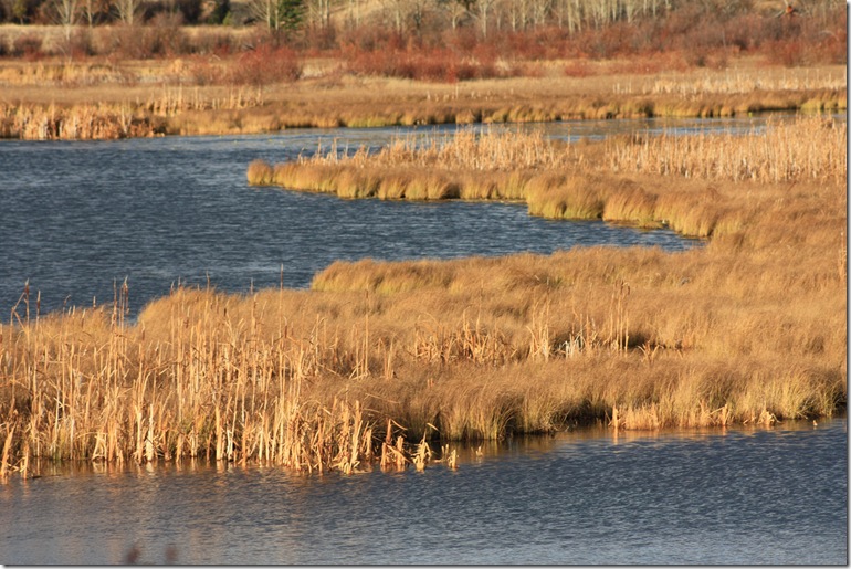
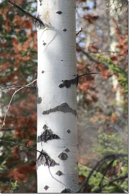
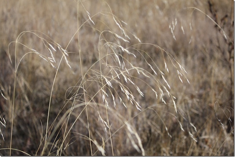
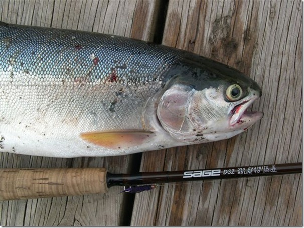
My Associate Interior Designer and CAD Technician extrodinaire, Carole Root, has just come back from a fishing weekend at a cabin set on Big Bar Lake. Big Bar Lake is situated in the High Country Region (or as it is commonly referred to as "The Cariboo") of British Columbia and is located north of Clinton and west of 70 Mile House. It is some of the most beautiful countryside I have set my eyes on. The weather was perfect autumn days when the colors are magnificent, crisp and clear. I can almost smell the lake and the freshness of the air when I look at these pictures. How wonderful to be out in nature, truly away from it all. Below are some of the pictures Carole took with her new camera, a Canon Rebel XSI. I hope these pictures are as much a feast for your eyes as they are for mine. Thanks Carole. Enjoy..........
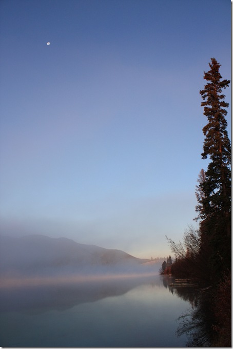
Big Bar Lake Sunrise (that is the moon still visible in the sky)

Gray Bird
Post Script Oct 30 2008 Gray bird photo is actually a Gray Jay otherwise known as a Whiskey Jack. What's in a name? Well our First Nations people knew this creature as "wiss-ka-tjon" or "wis-ka-chon". In the old-time lumbering days the Jay would visit the lumberjacks in the northern forests of Canada. In turn, the lumberjacks shared their grub with it and came to call it "Whiskey-Jack". Now the bird's modern "common" name is "Gray Jay" or "Canada Jay"(and its scientific name is Perisoreus Canadensis).
Patricia Gray writes about Interior Design inspirations, emerging trends, and the world of Design.
While you're here, subscribe to this feed so you don't miss out.
: : Göteborg, my hometown

 : : I've made a wonderful discovery of a new blog today [via .hei astrid.] The blog is called .smosch. by Sandra, an illustrator/artist who lives in .Göteborg., Sweden. My hometown! We didn't always live in .Göteborg., but it is where both my parents came from, grew up and where all of our relatives live. It's always been home to me. So finding .smosch. feels like connecting with a piece of home. .sandra. posts beautiful photos from her walks around the city, you can follow the changes of the seasons in her photos, and get a real feel for what life is like in the city. lots of fika [coffee breaks] at cafes.
I look forward to following life in my hometown through .sandra's eyes.
another great blog of life in .Göteborg., is of course, Elisabeth's blog .fine little day.
new kurbits


: : I've created some new color combinations of my kurbits patterns as wedding presents and presents for friends and family. I particularly like these ones on a black base, in the traditional colors of the region .Dalarna.
searching for sheets

: : with the past 3day weekend, we tried to make some progress on the apartment. the bedroom is closest to being finished. although there was a small disaster this weekend trying to get our curtains up (I was swearing in Swedish on Monday night).
we've been searching for sheets for a while now but are struggling to find what we want. ideally we'd like them to be organic cotton, we want to stay away from the white, and I'd love a bold pattern like the one above in gold, from .dwell studio. I've also taken a fancy for a particular.amy butler fabric., which I think has the perfect color combination for our bedroom. making a quilt is much too ambitious although I love the one in the photos. but maybe I could make my own duvet cover in this fabric?
if anyone has suggestions/ideas for places to find sheets, please leave me a comment.
In Conversation with Patricia Gray
The following interview was graciously done by Ivan Meade who is an Interior Designer in Victoria BC. He writes the
Blog Meade Design Group. I was so pleased and surprised when a beautiful orchid arrived by special delivery at my door
following Ivan's posting of his interview with me. The note on the orchid said "Thank-you so much for the Interview" Ivan Meade.
I am so honored to be interviewed by Ivan. He has done interviews with other Designers that I admire. Some of the interviews
you can read on his Blog are with:
Barbara Barry
Vicente Wolf
Thomas O'Brien
Kenneth Brown
In Conversation with Patricia Gray
Patricia Gray is an award winning, highly recognized interior designer from Vancouver, Canada, who finds time in her
busy schedule to update her interior design blog almost daily! and I know how hard this is. Her blog features her inspiration,
including other designers and architects that she admires not to mention sneak peeks of her stunning work. She has been
published in Architectural Digest, House and Home, Style at Home, Western Living along with other notable magazines.
Iván Meade - What was your first experience with design?
Patricia Gray - When I was 5 years old I remember rearranging the furniture in the Living Room.
Photograph courtesy of Patricia Gray
Iván – A client of mine sent me a link of your blog a couple of days after I launched my own blog last November – I have
to say that I still have a lot to learn . What does it mean for you to blog your ideas in design, your travel experiences and
basically open your personal life to the web?
Patricia – I started Blogging basically as a personal journal to record and catalog my inspirations. I thought it would be a
good forum to express myself outside of my professional practice as an Interior Designer. It has now taken on a life of its own.
Iván - What has been the best experience of being a design blogger?
Patricia – The other bloggers I have met all over the world. It is quite a network. I have made friends in Morocco, Houston,
New York. My readers are from all over the world and are very sophisticated and savvy. They keep me on my toes. Sketch by Patricia Gray
Photograph courtesy of Patricia Gray
Iván – Your interiors definitely celebrate restraint and order. To what/whom do you owe this influence?
Patricia – My Professor, Terry Kutcher ,when I was a student in Design School inspired in me a love for design.
He was meticulous in criticizing all my designs and floor plans. I learn to edit, to be selective, and to create rooms that had
a focal point and were unique. I was also very influenced in my formative years of study by the fabulous Michael Taylor, who
was at the time creating designs that were new and innovative and were totally suited to the times.
 Gastown Project
Photograph courtesy of Patricia Gray
Iván – There is an European influence in your timeless interiors, they are not just beautiful and contemporary, but they are
also very livable. How do you archive that?
Patricia – Part of the European influence I think comes from the time I spent studying Interior Design in Paris. It is very
important for me to create spaces that are comfortable, functional, and beautiful. I make sure that when you enter a room
you feel comfortable, when you sit down you have an experience with the space you are in and that you have beautiful things
to feast your eyes on. Editing is an important part of the process for me, because if you have too many things in a room, you
don’t appreciate any one thing in particular. Also important in editing is the details. They have to be executed to perfection.
 Gastown Project
Photograph courtesy of Patricia Gray
Iván - It’s the big installation day. What could have gone wrong did go wrong. How does Patricia Gray deal with that?
Patricia - You deal with one thing at a time. It is also important to work with a good team that are each experts in their
field.
 Gastown Project
Photograph courtesy of Patricia Gray
Iván – The popularity of the design shows on TV has brought interior design into homes all across our country. If you had a
show, how would you educate the viewers about interior design?
Patricia - That’s a big question. Design is a process and involves many steps to get to the end. I think that a lot of the detail
of this process is left out in the current shows. In a 30 minute show a home is completely finished. I think it would be educational
to follow a project week by week to completion.
 Laurel Residence
Photograph courtesy of Patricia Gray
Iván – A decor fad you hope never to see again?
Patricia – Well, I hoped that I would not see a revival of the 80’s, but it is upon us now. I am now really starting to appreciate
it again in a fresh new way. For example the resurgence we are seeing in the use of wallpaper. I still have clients that cringe
when I say the word wallpaper because they lived through it and the horrors of having to remove it from walls that were not
properly prepared for it. We go through phases in design and I think we become saturated, so we change and move on, then
a new generation comes along and loves the things of the past and breathes a new life into it.
 South Granville Project
Project Photograph courtesy of Patricia Gray
Iván – You recently returned from a design course in Italy, what was that experience like and what is next on your design
journey ?
Patricia – I spent a month in Italy studying Contemporary Italian Architecture. It was an amazing experience. I lived in a dorm
and rode a bicycle to classes in the most Beautiful Medieval walled city. The Italians have an appreciation for Design that is in
their blood. It permeates everything in their lives. For my next experience I want to spend some time in Belgium. Some of the
top design in the world right now is coming from this country.
 Laurel Residence
Photograph courtesy of Patricia Gray
Iván - Any words of wisdom?
Patricia – Take your time to make purchase decisions for your home. Buy fewer thing of better quality. Have only things
around you that you love!!
 Yaletown Project
Photograph courtesy of Patricia Gray
Iván - Lastly, you have already created a stunning body of work with many mediums and styles, what would you like your
legacy to be?
Patricia – That I created spaces that were memorable, stimulating to be in, and stand the test of time.
To see more work of Patricia Gray please visit:
www.onewilliam.com
www.onewilliam.blogspot.com
Posted by MEADE DESIGN GROUP
one biker to another

: : [heard on my way in to work this morning. from one biker to another]
" nothing really seems so bad when you're on your bike".
it made me smile, in a time when the world is crumbling around us.... maybe I am just best off on my bike...
: : tina & hans : :


 : : tina & hans got married on Oct 4th on an small island in the Swedish westcoast archipelago. their friends and families gathered on the cliffs by the ocean as the bride and groom arrived by boat just as the sun peeked through the clouds. beautiful pink, greys and blues throughout the wedding. the most beautiful wedding bouquet I've seen. blackberries and lavender mixed in with the table bouquets that tina put together herself. and of course, a beautiful bride and groom. a wonderful reception, with speeches, singing, dancing and games continued until the last ferry was leaving, by then the sunny weather had turned into storm and I returned home, my dress completely soaked. but that didn't matter. I had one of the best nights of my life. and I wish them all the happiness in the world!
: : louise & erik : :


 : : two weddings, four of my very best friends, in one week. so many magical moments, laughter, friendship and love.
louise & erik married on Sept 27th. a beautiful, small, bright colored wedding set in the country by a large estate. louise was adorable in her sweet dress made by her grandmother. and erik more handsome than ever. the ceremony took place in a sun filled greenhouse, the reception followed in one of the old, stone houses surrounding the estate. the party went on well into the morning, the bride and groom left only 1 hr before the guests did. walking out hand in hand through the tall hedges, the sky filled with fireworks and their friends and families waiving from behind. a day to remember! I was thrilled to be able to be there, to be involved with the wedding, help with preparations and spend so much time together with louise, erik and their families. I wish them all the happiness in the world!


